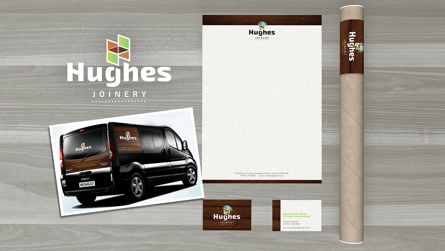
James Hughes wanted a logo designing for his joinery business which focusses on making bespoke garden rooms and timber framed buildings.
James was persuaded to use just his surname to avoid looking too much like a one man operation and allow for future growth. The isometric H was inspired by timber panels and the colours suggest garden and outdoors. The modern typeface is a heavy, sans-serif font modified to be unique and follow the angles of the image. An accompanying backdrop of woodgrain helps to communicate the type of business without being too specific and allows for diversifying.