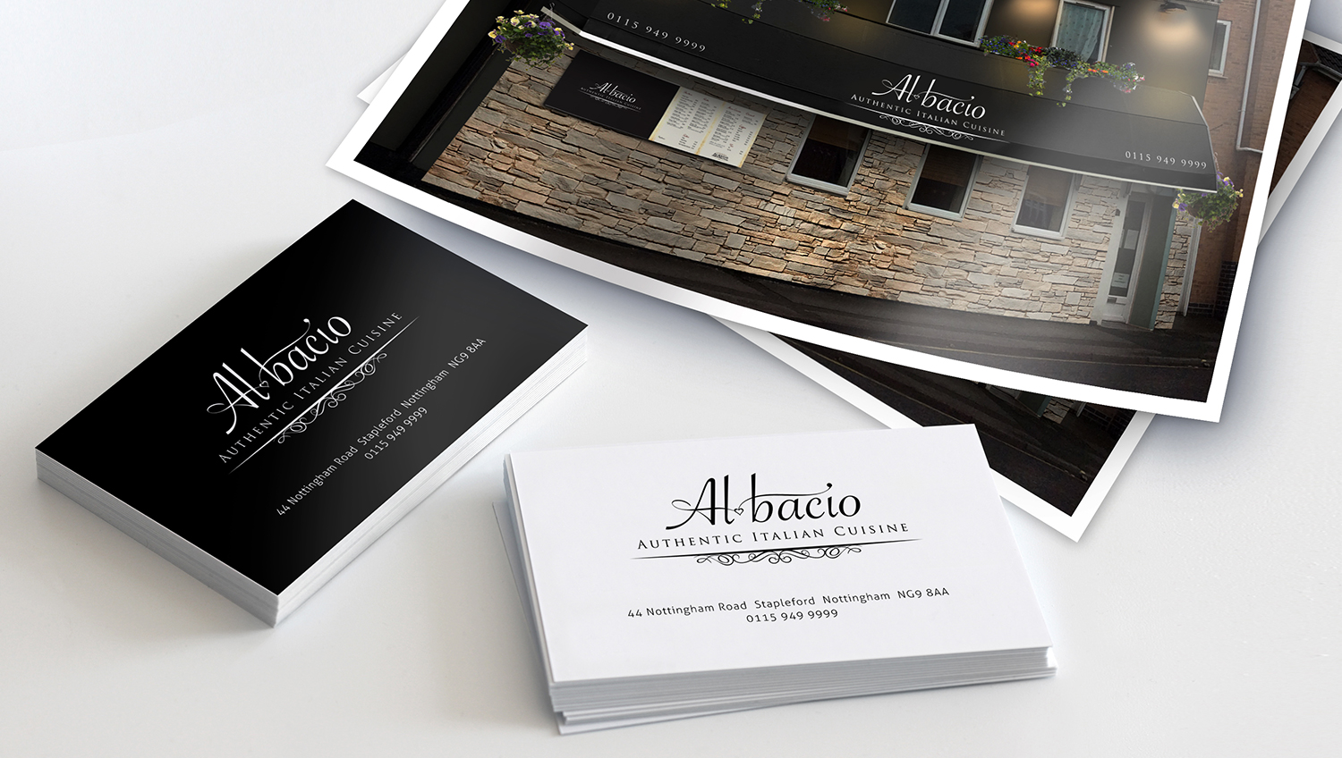
An Italian restaurant, owned by a couple from the Puglia region in Italy, needed a re-designed logo to give their establishment a more upmarket feel, while conveying an authentic Italian feeling.
Al bacio translates to ‘as good as a kiss’ and is the phrase associated with the gesture of a chef’s kiss. As such, a discreet heart was incorporated into the logotype. The script has an elegance and flair and the flowing lines suggest an artistic style of cooking. Classic Roman lettering and a flourish underscore complete the identity.
I was also asked to suggest how they might improve the exterior. A canopy to help shelter customers when reading the outside menu and partial brick cladding was proposed as well as charcoal grey repainting of the tired looking walls. Lighting and flowers add inviting finishing touches.