Arthur Stephenson Engineers is a fourth generation family run business based in Atherton, Manchester. It specialises in the batch production of medium to large sized, machined components and fabrications.
The company has traditional values and wanted to reflect this, as well as communicating a timeless, long established image.
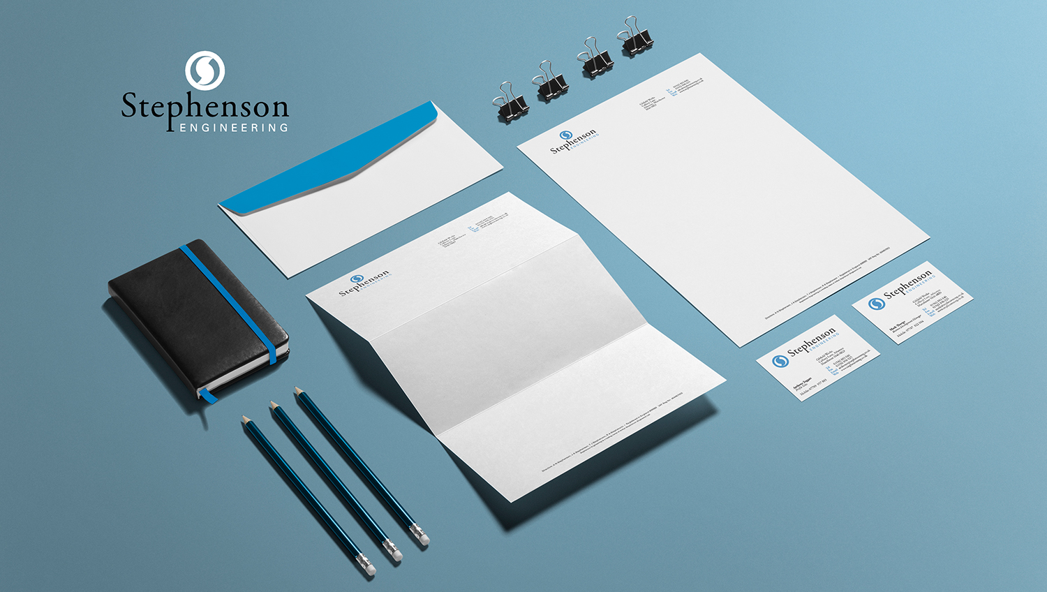
The stylised S is inspired by a machine cutting tool used in their fabrication process and visually punctuates wherever the logo is applied. The S appears to rotate within a circle. A classic style typeface was chosen for the logotype in keeping with the ‘timeless’ message. It has an extended ‘p’ to add a unique touch.