SUP&R International Training Network (ITN) is a training-through-research programme with a network across Europe. It is multi-disciplinary and multi-sector with a focus around transportation engineering and sustainability.
The objective was to design a modern identity that communicates the ‘multiple’ aspect of the project and the coming together of various sectors.
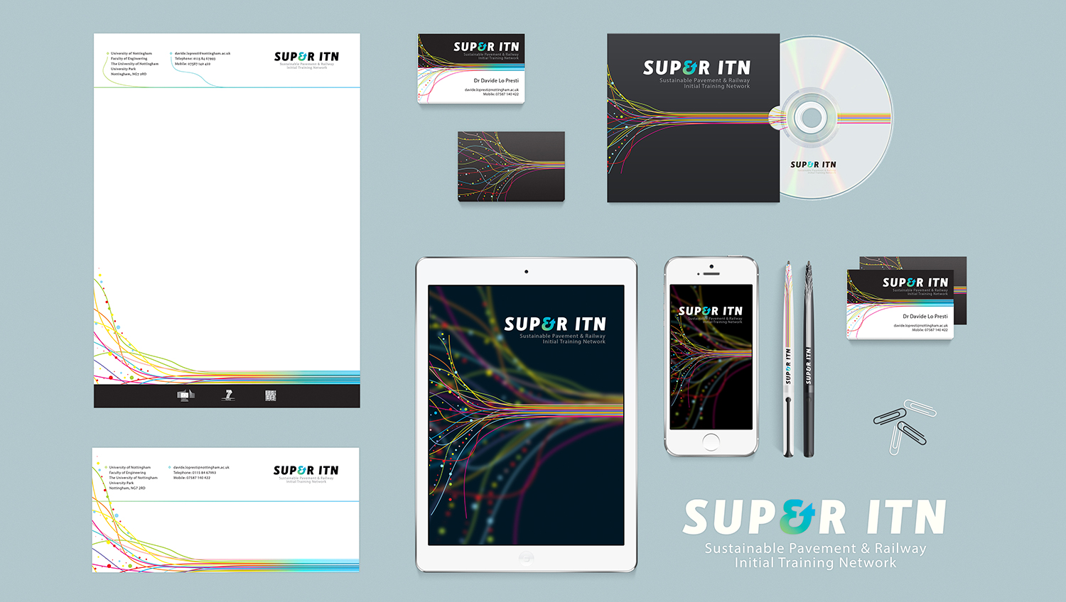
The typographic treatment takes advantage of the acronym (S.U.P. & R – Sustainable Pavement & Railway) reading as SUPER by using a suitable ampersand. This is picked out in a gradient colour and can be used, in some cases, on its own as a graphic element.
The supporting graphic represents the coming together of the various disciplines and provides a continuity motif across all the identity’s applications.