Italian health food company ‘HappEat’ wanted to re-brand their range of ‘healthier’ muffins. I was asked to propose a brand logo and packaging designs.
Muffit is a product that is a healthier option made with simple and natural ingredients – the design should reflect this.
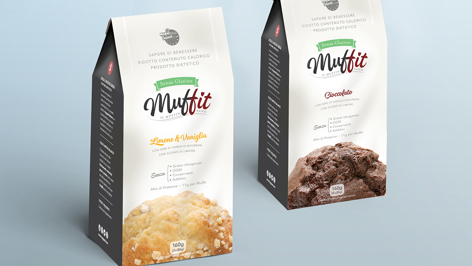
For the branding, I added a subtle shift in colour to pick out the word ‘fit’ and included a heart symbol to the bouncy handwritten lettering.
In order to redesign the packaging, it was necessary to point out some of the issues and concerns with their existing design. These included:
The design proposal has attempted to achieve a less cluttered, less chaotic design. However, I feel there is still too much information for a product such as this. While key information is useful to the consumer, too much can be off-putting and therefore have a negative affect. The consumer will not want to spend a lot of time reading information in a supermarket or shop. Maybe it can be reduced in some way? An alternative option to limit the excessive text on the package would be to put some of the information on a small pamphlet inside the package.
Despite being a healthy option, the Muffit is still a treat and so wants to retain some feeling of luxury. The target audience is likely to be environmentally conscious and so it would have more appeal if the product were packaged in a biodegradable bag rather than a box, which seems too wasteful.
Their existing packaging communicated the idea of a sports supplement product. These types of products can often be associated with unnatural ingredients. The design should instead communicate a healthy option food product.