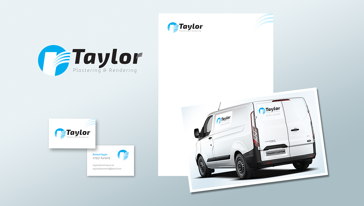
Richard Taylor wanted to step up his plastering business and launch a fresh new image that would provide a more professional look.
Richard was persuaded to use just his last name to give a more company-like appearance and to allow for future growth of the business. The logo uses a graphic representation of a plasterers trowel in action which also represents the ‘r’ for his first name. The bold italic font has a contemporary, yet business like appeal. The trowel motion is also suggested in the modified letter ‘y’ and adds a touch of individuality. The result is a modern, clean and no-nonsense identity.